How to size a QR code for print
Updated
How big to print a QR code, how much blank space it needs, and which colors, logos, and file formats keep it scannable.
A QR code that scans on your monitor can still fail on a poster. Phone cameras need enough pixels per square to read the pattern, and a printed code gets smaller in the camera's view the further away someone stands. This guide covers the things that decide whether a printed code scans: size, blank space, contrast, logos, and file format.
Size depends on scan distance
The most useful rule of thumb is a ratio of about 10 to 1: the code should be at least one tenth as wide as the distance people will scan it from. It is a starting point, not a guarantee. Camera quality, lighting, and how much data the code holds all move the number, so round up when in doubt.
| Where it is scanned | Typical distance | Minimum code width (rule of thumb) |
|---|---|---|
| Business card, product label | 25 cm (10 in) | 2.5 cm (1 in) |
| Flyer, menu, table tent | 50 cm (20 in) | 5 cm (2 in) |
| Poster on a wall | 1.5 m (5 ft) | 15 cm (6 in) |
| Window sign, yard sign | 3 m (10 ft) | 30 cm (12 in) |
| Billboard, banner | 10 m (33 ft) | 1 m (3.3 ft) |
Two cases need more room than the table suggests:
- Codes that hold a lot of data. A long URL, a Wi-Fi login, or a full contact card makes the grid denser, so each square is smaller at the same overall size. Shorter content gives you a coarser pattern that scans from further away. A dynamic code helps here, because it only holds a short link no matter how long the real destination is.
- Codes people scan at an angle or while moving. A sign seen from a car park or across a platform should be larger than the distance alone implies.
Around 2 cm (0.8 in) is a sensible floor for anything scanned at arm's length. Below that, print quality starts to matter as much as the phone.
Leave the quiet zone empty
A QR code needs a blank border around it so the scanner can tell where the code starts. The QR code standard (ISO/IEC 18004) specifies a quiet zone four modules wide on every side. A module is one of the small squares in the pattern.
That border counts as part of the code. Do not let a designer crop it to fit a layout, and do not place text, a border line, or a busy background right up against the pattern. If the code sits on a photo or a patterned surface, put it on a solid light panel that includes the quiet zone.
In KeeperQR, new codes are exported with a four-module quiet zone already included, so keep the whole exported image intact when you place it.
Use strong contrast
Scanners look for the difference between dark and light modules. The safest choice is a dark code on a light background.
- Dark on light. Black or a deep brand color on white or a pale background. Test mid-tones such as orange on yellow or grey on light blue before you commit, because they often look distinct to people and similar to a camera.
- Avoid inverted codes. A light code on a dark background is allowed by the standard, but some scanner apps still fail to read it.
- Watch the print process. Colors converted for print can come out darker or lighter than on screen. Check a physical proof, not the PDF.
- Avoid glossy glare. Laminates and glossy stock can reflect light across the code. A matte finish scans more reliably.
Error correction and logos
QR codes carry redundant data so that a partly damaged or covered code still reads. There are four levels:
| Level | Roughly how much of the code can be lost |
|---|---|
| L | 7% |
| M | 15% |
| Q | 25% |
| H | 30% |
Higher levels add redundancy by adding modules, so the pattern gets denser. The highest level is not always the best choice, because a denser code needs to be printed larger.
A logo in the middle of a code works by hiding modules and relying on error correction to recover them. Keep the logo small and centred, never cover the three large corner squares, and use a high error correction level when a logo is present.
KeeperQR handles the level for you. Codes use M by default and switch to H as soon as you add a logo or emblem.
Export in a format that stays sharp
A QR code enlarged from a small, low-resolution image gets blurry edges, and blurry edges make modules harder to read.
- SVG is a vector file. It stays sharp at any size and is the best choice for anything going to a printer.
- PNG is fine when the printer or layout tool needs an image. Use the largest resolution available and do not scale it up past that.
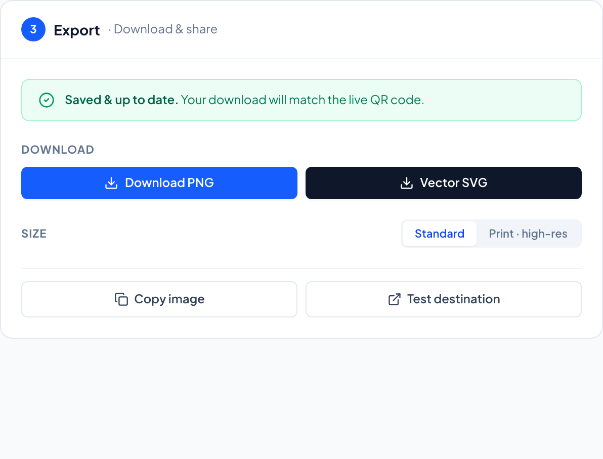
In KeeperQR, the Export step offers SVG and PNG, with a print resolution of 2400 pixels for PNG.
Surfaces that cause trouble
- Curved surfaces such as bottles and cups distort the pattern. Keep the code small relative to the curve, or place it on a flatter part.
- Folds and seams through a code break it. Keep codes away from the fold on brochures and packaging.
- Outdoor print fades and gets scratched. Error correction covers some damage, but plan to check the code again after a few months.
Test at real size
None of these rules replace a scan test. Print a proof at the final size, on the final material, and scan it from the distance and angle people will actually use. The test before you print checklist covers what to check.
If the code is part of a campaign, the QR campaign best practices guide covers placement, calls to action, and reading the results.
Codes that keep working after you stop paying
Dynamic QR codes with real scan analytics. 14 days free, no card.
Start your free trial